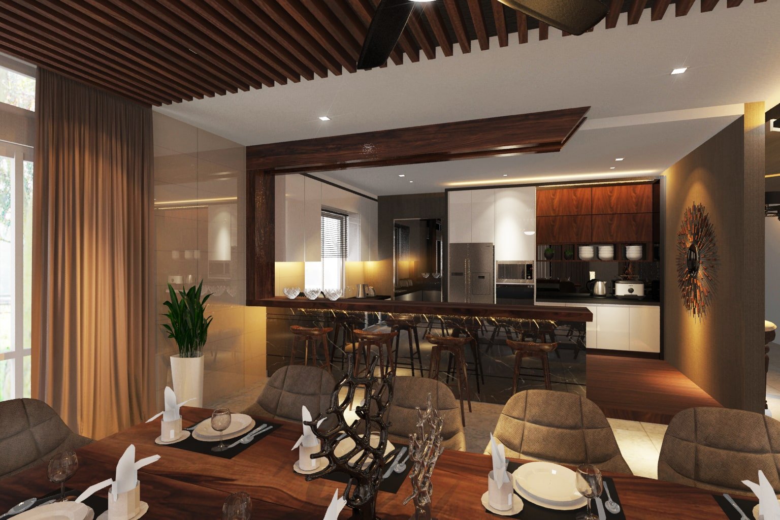
From the moment you enter a store, your subconscious mind is being swayed into a sensory odyssey with one objective in mind: TO BUY
Retail giants, top tier brands have been practicing these trade secrets for a while now.
Not to say that this is a bad thing, rather the opposite.
Whether you’re in the retail or service industry, these strategies work so well that customers may take their business elsewhere if you do not have these elements in place.
Our aim is not to teach you how to “manipulate” your customers,
But to show you proven ways on how to create functional commercial spaces that drive your business goals and outcomes.
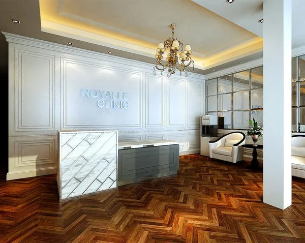
The benefits of interior…
If you’ve been following our content for a while, you’ll know how passionate we are about design principles and how they stimulate the sense of our human spirit.
For instance,
Have you ever visited a store that looked so depressing you felt sorry for who ever was working behind the counter?
Likewise, do you enjoy the way you feel when you walk into a Apple store? Whether or not you plan on buying anything?
Or the main reason you keep coming back to Starbucks? (we all know its not because of the quality of the coffee)
We go back because we like the atmosphere it puts us in, as well as the personalized experience it offers us by writing our name on the cups.
Interior design and the physical environment is an excellent way to create a unique customer experience, develop a longer lasting impression and nurture a connection with your brand.
Here we will talk about how you can use these principles to improve the layouts of your retail stores or integrate the concept of your brand identity into your commercial property.
Leveraging Brand Identity:
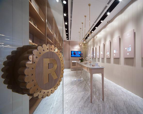
Take a moment to reflect, “what do my customers experience or feel when they enter the door?”
Your brand is the message of your business, its what it stands for and it communicates what your service does or doesn’t do.
It is the identity and essence of your business and what your customers come to you for.
In today’s market, customers are all about having a unique experience.
The last thing you want is to become another “me too” company that offers the same experience as your competitors.
Your brand is a good thing, it’s an opportunity to show why your so special and what you offer better than the rest.
By having a powerful brand, you not only attract new customers and get them engaged, but you also turn them into your own personal promoters.
Especially in today’s digital age, smart commercial brands are combining interior design and technology to create awesome experiences for their customers that entices them to share it on their favorite social channels.
Word of mouth will spread fast online if done right.
A good example of a global commercial brand that utilizes interior design is Starbucks.
Your Mission Statement Is Your Structure:
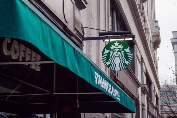
In 1983, before Starbucks became what we know it as today.
Howard Schultz (president & CEO) at the time was working for Starbucks.
After his trip to Milan, he was captivated by the coffee experience that Italian coffee houses offered.
He realized it wasn’t about drinking the coffee, but rather it was about how the Italians gathered and communed for conversation.
It became a third place in between work and home, he knew at that moment he had to bring back that experience to the US.
He returned and started his own coffee house “II Giornale” for a short time before going back and purchasing Starbucks with the help of Bill Gate’s father.
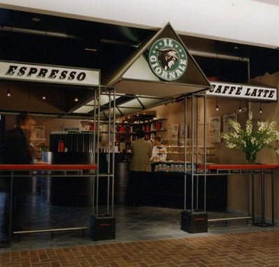
From that day on wards, Starbucks set out to change the coffee culture for history.
One that brought the feeling of connection and personalization.
Hence their motto:
” to inspire and nurture the human spirit – one person, one cup, and one neighborhood at a time “
They took that concept from the way they deal with customers, all the way down to how their shops are designed.
Every Starbucks is designed to fit the local district that it belongs to, no store has the same design. Hence “neighborhood at a time”.
And they ensured that every store was inline with the local culture it served in conjecture with their brand.
Which is why anyone who has ever been to a Starbucks is able to recognize their design as they have made their interior an extension of their brand identity and customer experience while remaining true to their mission statement.
They only focused on one store, one customer, one cup.

And by personalizing the customer experience to such a level, they were able to build a multi-billion dollar brand in one of the most competitive markets that is coffee.
An image says a thousand words, in this case; your logo.
So picture being able to take the meaning behind that image and translating it into a physical environment.
Humans experience the physical environment with their thoughts and emotions, which means they’ll be able to experience your brand on an internal level, which in turn will influence their behaviors.
But first you need to determine the core of your brand…
Take your unique selling proposition and break it down.

What does it stand for? What is the true purpose of your business? And what would you like to communicate to your customers through feeling?
Then think strategically about how you can translate this into your interior architecture by the following:
- branding colors.
- lighting and atmosphere.
- furniture, materials and decor.
- form and function: (do your customers require waiting areas, product trials, etc.)
- awards gallery: does your business require high trust and credibility?
- immersion: can you find a way to get them away from their auto-pilot mode and into a new world?
Think of it like a good film, the more you can immerse the audience in the story and the world your showing, the more likely they are to believe what they are seeing.
We all love to be taken away to somewhere else, people want to escape their every day lives.
And a powerful brand can offer that for them. It will stir and evoke their emotions and build customer loyalty in the long run.
Boosting Sales Through Retail Design:
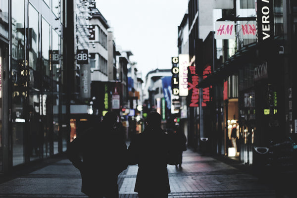
It’s no doubt you’ve heard of the e-commerce boom in the past decade.
In a study performed by Amasty with Statistics pulled from Statista, e-commerce accounted for a 11.9% share of global retail sales in 2018
With sales performed on mobile accounting to 70% by the end of 2018.
In addition to that, the top emerging e-commerce markets with the highest growth rates are Malaysia, Taiwan and India .
In the USA alone Amazon accounts for 49% of total e-commerce sales and 5% of the country’s total retail sale in 2018
Why do these numbers matter?
Despite the massive growth of online retail and the amount of brick and mortal stores we hear closing down in the headlines.
Offline retail still accounts for the larger majority of purchases (for now at least)
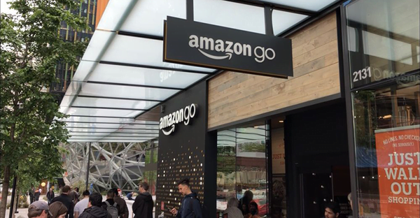
Let’s take Amazon for example,
Their recent purchasing of Whole Foods and development of Amazon Go (cashier less stores)
Is a clear indication that the retail giant still sees potential in brick and mortar stores, despite the fact that you can order something and have it delivered within 2 hours straight to your order.
This boom in e-commerce has paved way for large amounts of data and insight about customers purchasing behaviors.
The good news is that this data can be directly translated into your physical business layout.
Build A Sales Funnel:
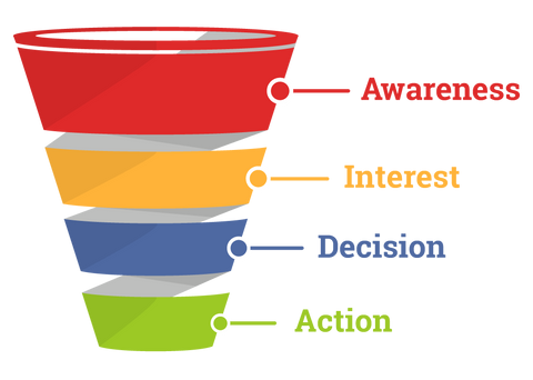
Much like a website funnel, the way your in-store layout is structured and designed plays a significant role on whether people end up purchasing your product or not.
Having a clean straight forward website that directs people to add products to carts and proceed to checkout is crucial for your marketing budgets and breaking ROI.
Having trust badges and looking legitimate can make the difference between people leaving the website or staying.
When a website has too much going on, customers and visitors will get overwhelmed with too many choices and experience decision making fatigue, this leads to no action being taken.
What you want is directive, limited choices (if not just one choice) to create a funnel that doesn’t distract people from the objective which is to BUY your product.
If you recall eating at 5 star restaurant, there’s usually only a handful of items on the menu.
That’s the approach you want to adopt,
This in turn can can increase your ROI percentage and really allow you to milk your marketing budget for every dollar you spend.
So how do you translate this into interior design?
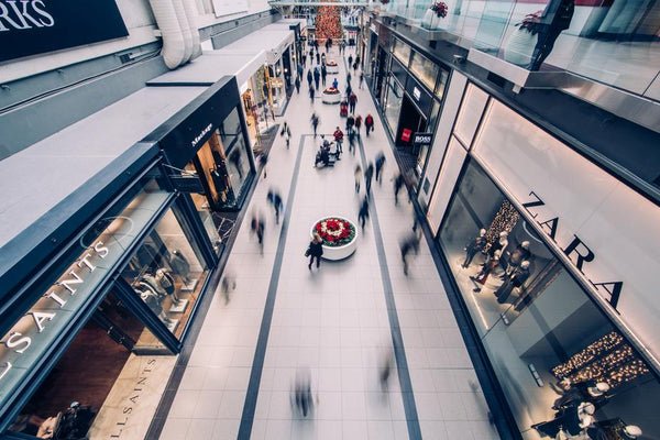
Circulation:
Good circulation layout. Having a well thought out and easy navigation is what will improve the rate of your purchases.
If you make it difficult for customers to find what their looking for, they will leave your store confused and frustrated.
Clear navigation will not only make it easier for them but will make promotional aisles more apparent.
This gives you the chance to place your best selling products in a place where they will visually be able to see them and in return, increase the amount of sales.
Now you might be wondering, “but what if I want to increase the amount of time people spend in my stores?”
There are many work around for this,
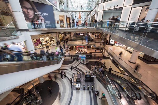
Many grocery markets will place the best selling items or commonly purchased items at the middle or back of stores.
This was a response to what they call “The Boomerang Effect” which is when shoppers walk in, get what they want and walk out the way they came.
Which is why typically you find most changing rooms at the back end of retail stores, so that you pick out more clothes along the way.
By strategically placing the most commonly sold items at back and the most popular items in the center, you increase the chance of customers having to see most of your products along the way.
Well designed shopping malls also combat this by the way they allocate their escalators. Ever wonder why escalators can’t just be right next to each other?
Yup, you guessed it. They want you to walk along more stores in the chance that you shop more than intended.
Sounds good right? It gets even better.
The Eye Distance Test:
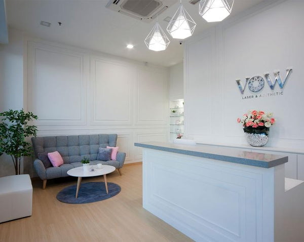
The more expensive products and brands are typically placed within eye level so they are noticed first.
While lower quality cheaper brands are placed at the bottom so people have to kneel down for them (human nature is all about reducing effort and maximizing gains)
For a more luxury store, focus on your window displays.
Use a singular colored theme to draw attention to your displays, if there’s going to be any text make sure it passes the eye distance test.
Stand where customer traffic is and see whether its readable or eye catching enough.
Use less clutter in your window displays because in retail, more space equals luxury.
Think about how Rolex displays items on their windows, there’s only ever a handful of watches.
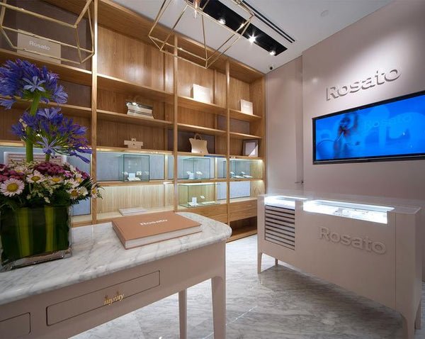
This gives the impression that the items on display are more exclusive and special.
Use shorter and more narrower shelves which makes the store look full without having to stock up on too much merchandise and provides better line of sight into the rest of your store.
If you run a luxury store that sells expensive items that require more thought, use warmer lights, this makes users more comfortable and spend more time in your store.
Here’s a few quick rules of thumb we can learn from the way Amazon boosts sales on their platform
1) showcase best selling products first in order of expense.
This takes the customer on a mental journey, as they progress through the store the prices get lower and they have more of an incentive to buy as it seems the deals get better and better versus the opposite.
2) cashier visibility
Just the same as e-commerce, the harder it is to complete your purchase, the worst your conversions.
Make sure the cashier counter is as visible as possible from where it’s stationed.
3) Up-sells and bundles:
If you go to H&M or Zara, u’ll notice that along the line to the cashier are a row of lesser expensive items or “add-ons”
Once a customer has decided to agree to buy a certain select of items, they are already in a receptive state to buy more
By having a selection of cheaper items on the way to the cashier, there’s a higher chance people will be more prone to buy them.
This will increase the average order value of each customer and has proven to work over and over again.
Conclusion:
It doesn’t matter what kind of business you are.
If you’re in an industry that requires your customers to come to your physical location you can benefit from branded interiors and retail layouts.
Just remember…
Whatever you decide, all the design elements should work together in order to have a cohesive physical and stimulating environment that evokes emotion, engagement and experience for your customers.
By aligning every design decision to your mission statement, you can increase the value of your brand, build customer loyalty and increase sales revenue in the long run.
If customers are walking into your store but not buying products or engaging your service, that’s a good thing.
It’s a sign that you need to up your game and that there’s a sink hole somewhere between what you are communicating and what you are actually offering.
Does your business need more sales?
Click here to get a free budget plan for branded and retail interior from certified interior designers in Malaysia,
And we’ll advise you on the best course of action.
Leave a comment below to share your thoughts, we’d love to hear them!


